TLDR
Design resource on McMaster-Carr’s “Navigation by Images” program—a systems effort defining how product imagery supports discovery, comparison, and confidence across 600,000+ SKUs. Contributed to scale-comparison patterns, pictogram guidelines, material rendering standards, and search improvements. Helped codify design principles for internal teams.
The core challenge: making images work as navigation infrastructure at catalog scale, where hero photography doesn’t scale, many products look nearly identical, and everything has to respect McMaster’s performance-first, grayscale, functional aesthetic.
Context: The Fastest Site You’ve Never Heard Of
In late 2024, McMaster-Carr went viral. A tweet remarking on how fast their site was got tens of millions of views. Web developers dissected their technical stack, marveling at how a 100-year-old company achieved sub-200ms page loads using “legacy” technology (ASP.NET, jQuery, YUI from 2008). McMaster’s speed isn’t accidental. Server-side rendering, aggressive caching, prefetching on hover, fixed-size images, no tracking scripts. Performance as a design principle, not an optimization.
But speed is only part of what makes McMaster work.
Adam Savage calls their catalog “the mighty McMaster-Carr”—a reference guide that “unlocks the utility for all manner of esoteric tools and hardware supplies.” Engineers, fabricators, and makers treat the site like a beloved tool. The design is functional to the point of austerity: minimal cognitive load, maximum information density, zero friction between “I need a thing” and “I found the exact right thing among 600,000 options.” The grayscale palette, the text density, the lack of visual flourish—these aren’t limitations of the design. They are the design.
As Unmatched Style put it: “McMaster-Carr is proof that design isn’t about decoration, it’s about intention.”
I worked with McM for about a year as an experienced hire on the UX team. The environment was rigorous, data-driven, and—frankly—more brutally competitive internally than anything I’d encountered before. The systems thinking, though, was some of the most interesting work I’ve been part of.
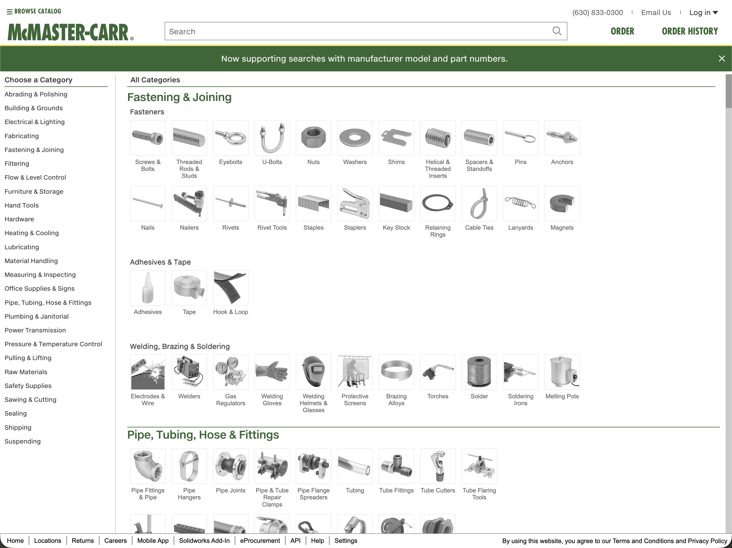
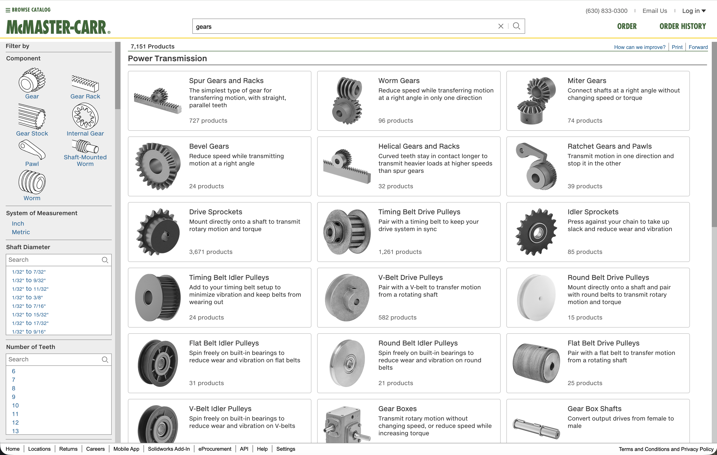
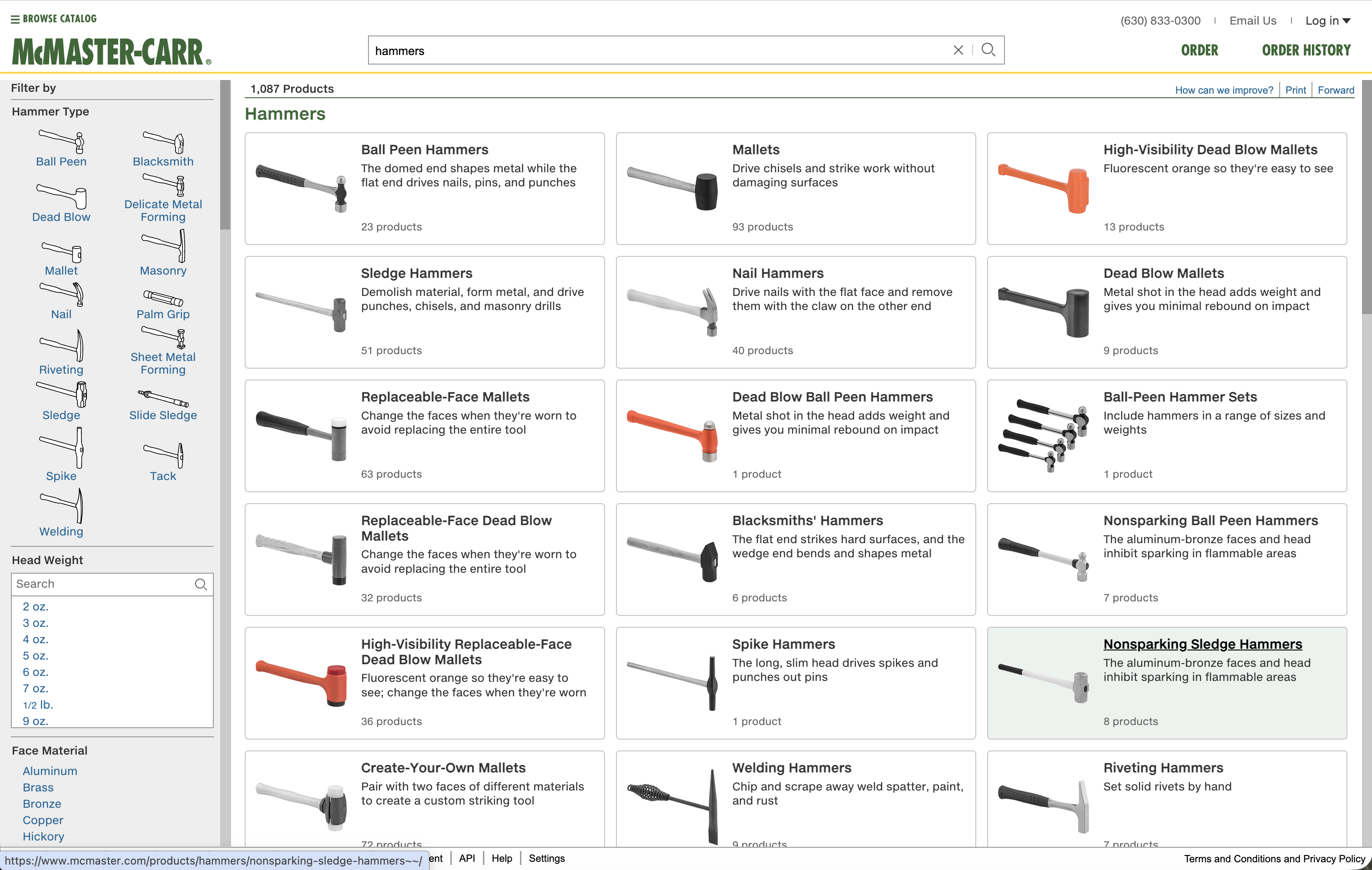
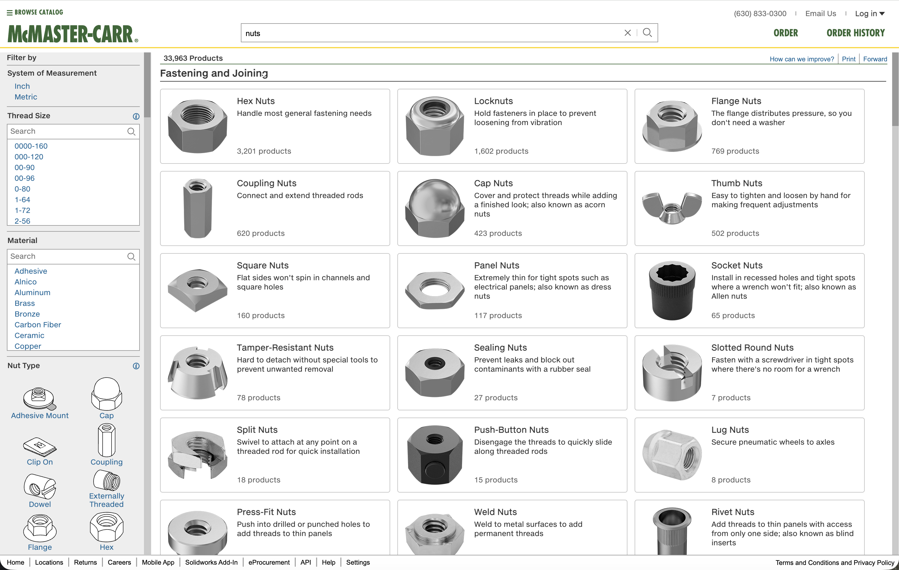
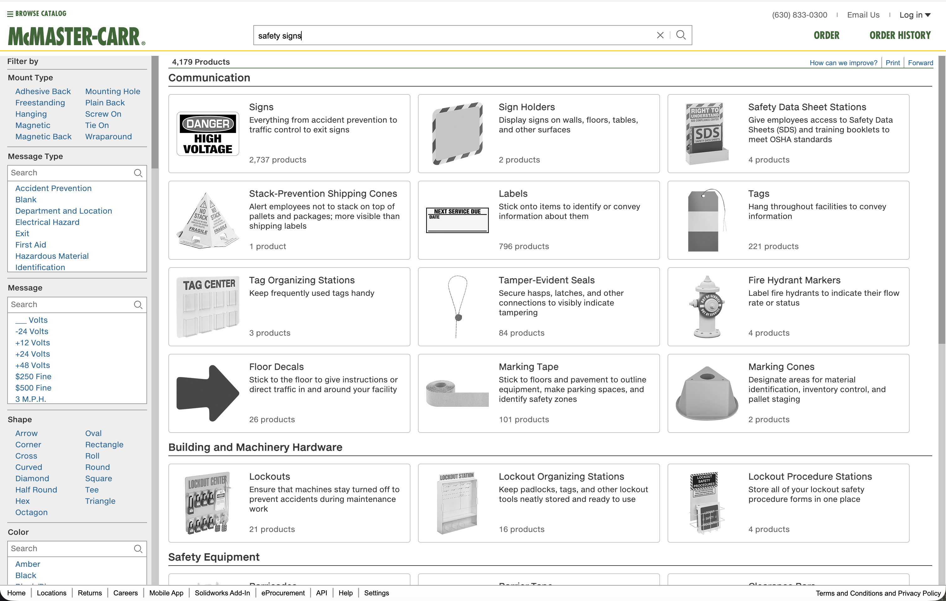
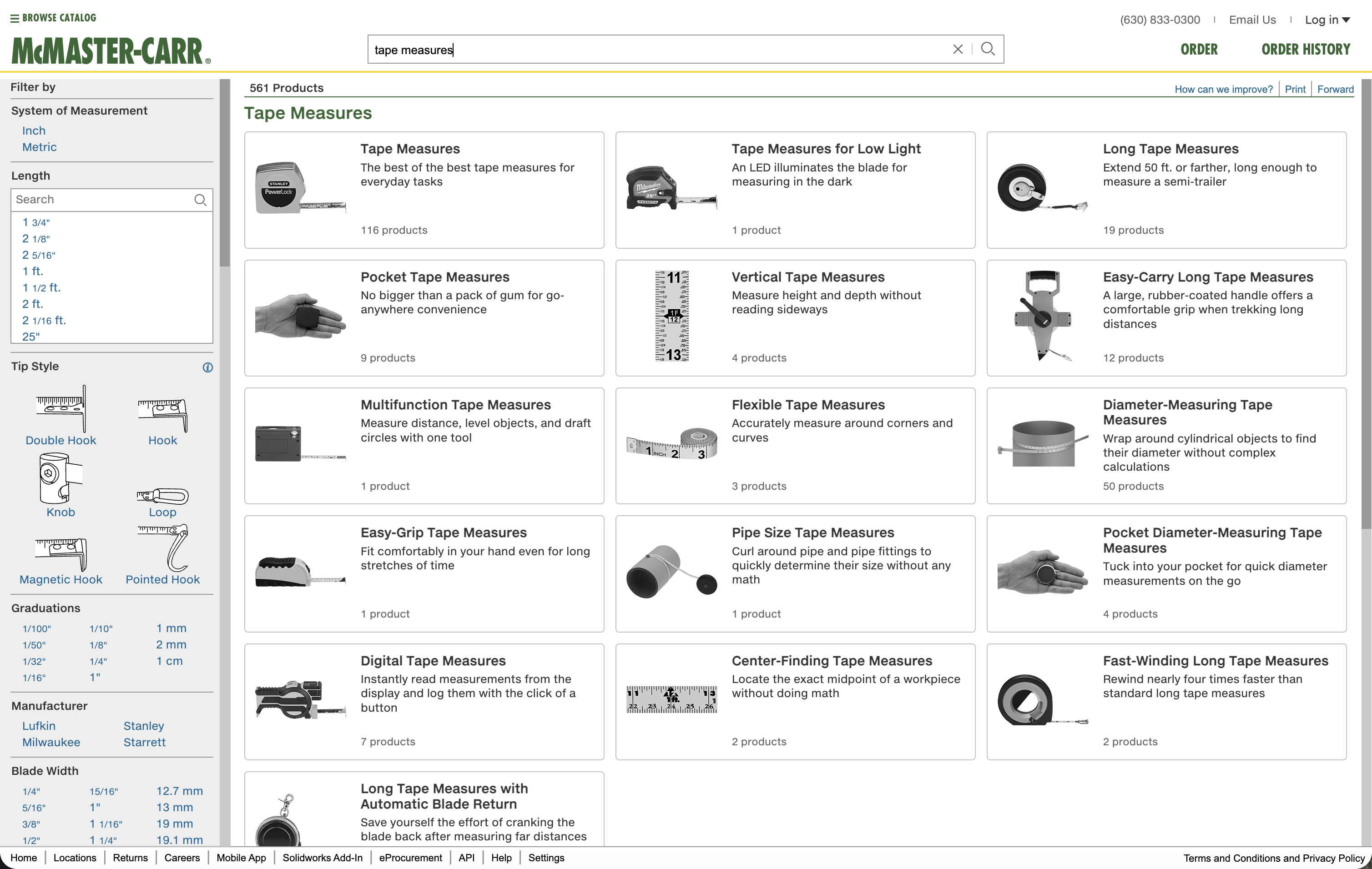
The Challenge: Images at Catalog Scale
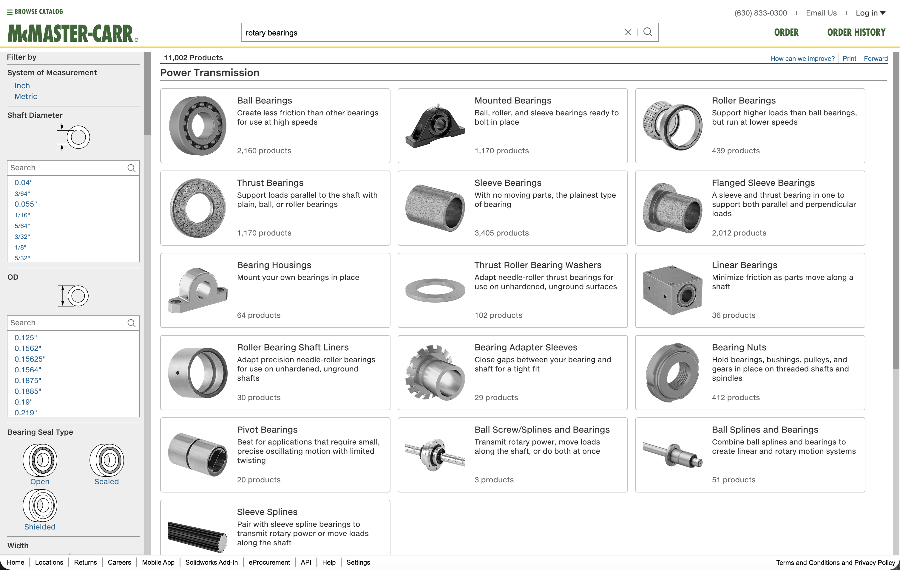
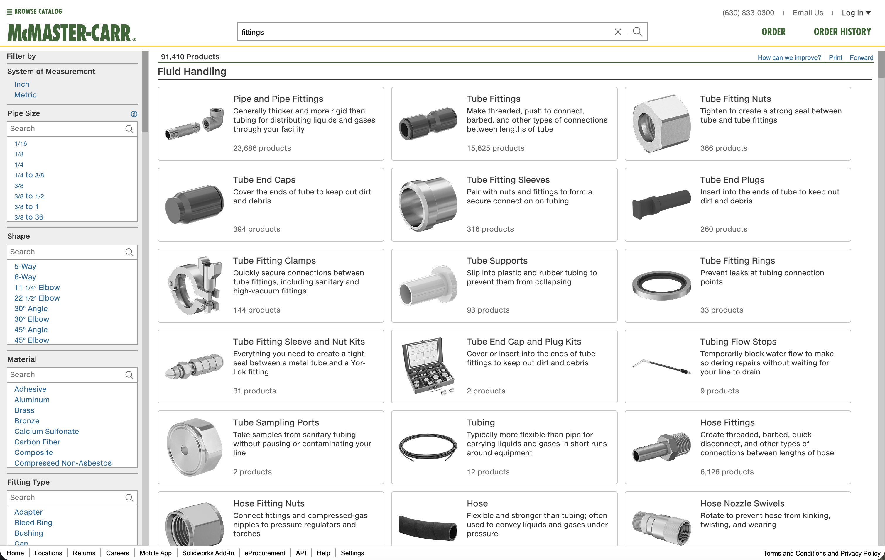
McMaster-Carr has a problem most e-commerce sites don’t: 600,000+ products, many of which look nearly identical to the untrained eye. A 1/4”-20 hex bolt and a 1/4”-20 socket head cap screw are different parts with different applications, but if you’re not already familiar with fasteners, they’re both “small metal cylinders with threads.”
Hero product photography doesn’t work at this scale.
McMaster has hundreds of thousands of CAD files (engineers download them to mock up designs). These CAD assets could, theoretically, be rendered into product images. But how? At what sizes? With what lighting? What level of detail? And the harder question: what job should these images actually do at each stage of the navigation journey?
That last question was the core of “Navigation by Images,” the program I was brought on to support.
Navigation by Images: Image as System
The idea that held the program together: images aren’t decoration, they’re navigation infrastructure.
At different points in the customer journey, images serve different cognitive functions:
Discovery (browsing, exploring): Images help customers recognize categories visually. “I know what kind I needed, but I don’t know what it’s called.” Shape, silhouette, high-contrast forms matter more than surface detail.
Progress (narrowing options, comparing): Images help customers distinguish between similar items. Head type, thread style, material finish need to be legible at a glance.
Confidence (verifying the exact right part): Images confirm what customers are purchasing. Accuracy matters. Scale matters. Context—how big is this thing, actually?—matters.
What we developed:
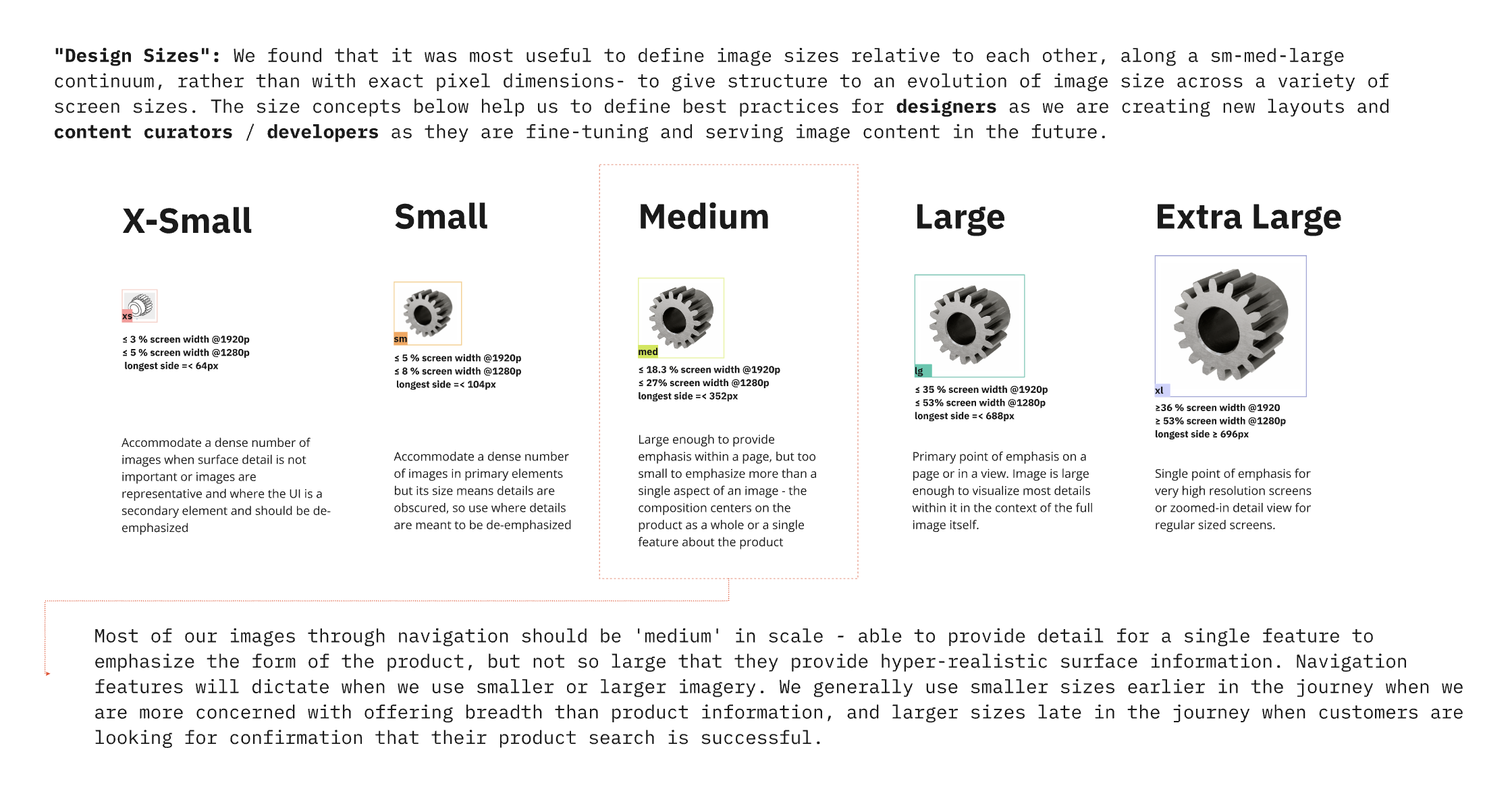
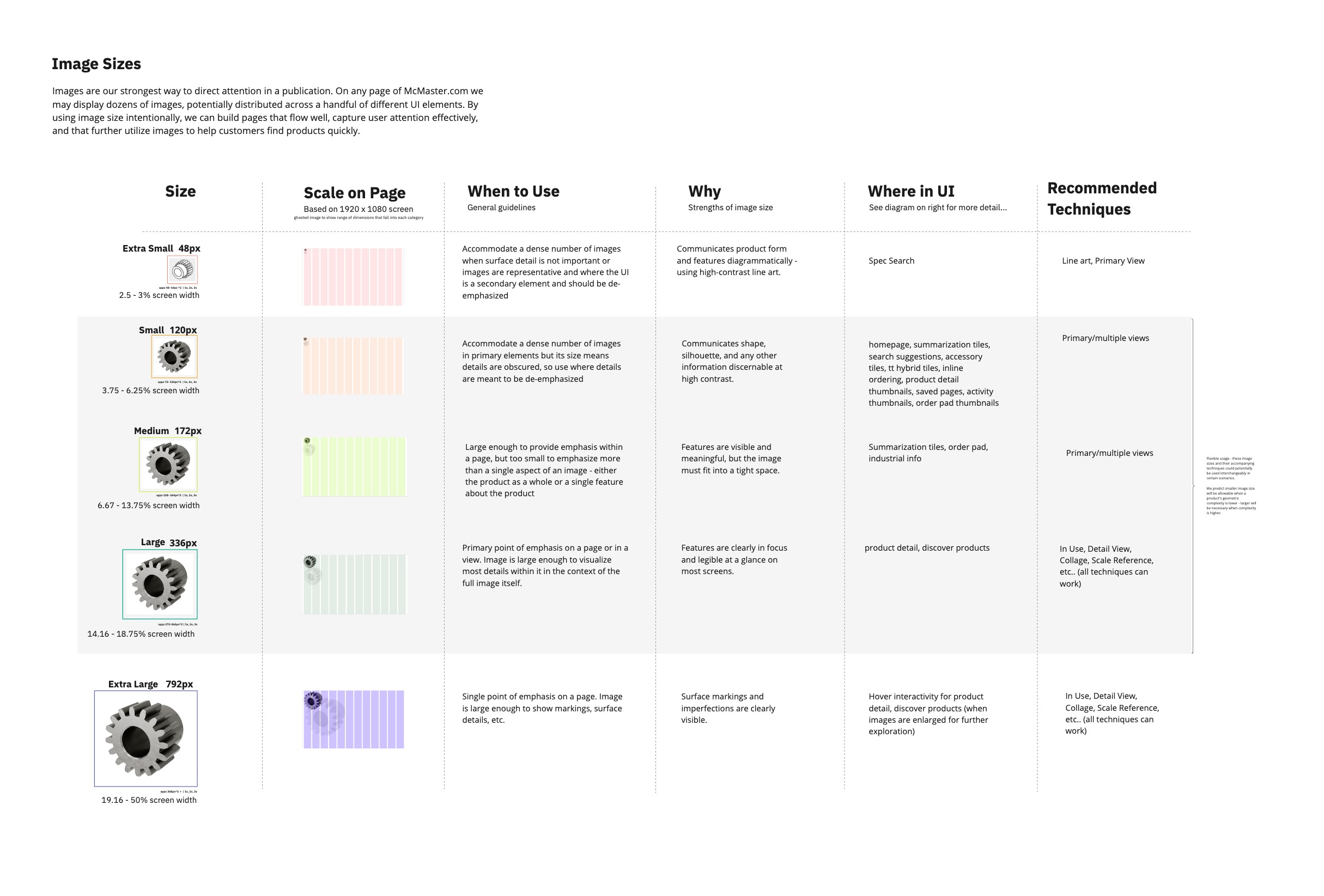
- Image sizes as a semantic system (eg: xs ~48px, sm ~120px, md ~172px, lg ~336px, xl ~792px). Not arbitrary breakpoints—sizes tied to specific UI contexts and user needs.
- Rendering guidelines for when to use CAD renders vs photography vs hand-drawn spec art.
- Lighting and material standards that balanced visual clarity with brand consistency (the grayscale palette).
- Scale comparison patterns. Products shown against human hands, fingers, full body silhouettes, making invisible dimensions tangible.
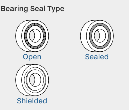
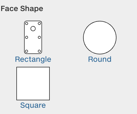
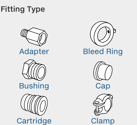
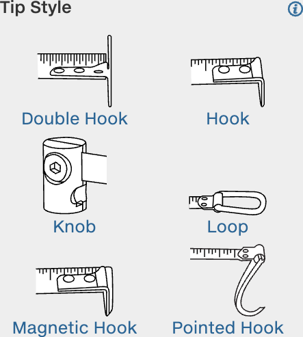
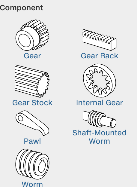
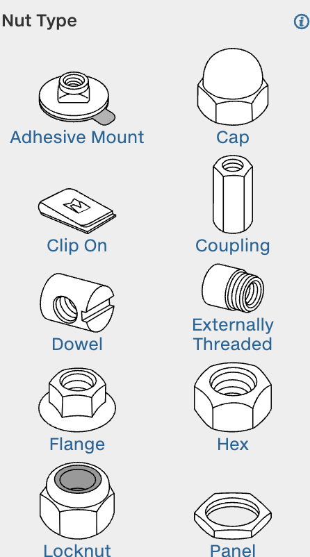
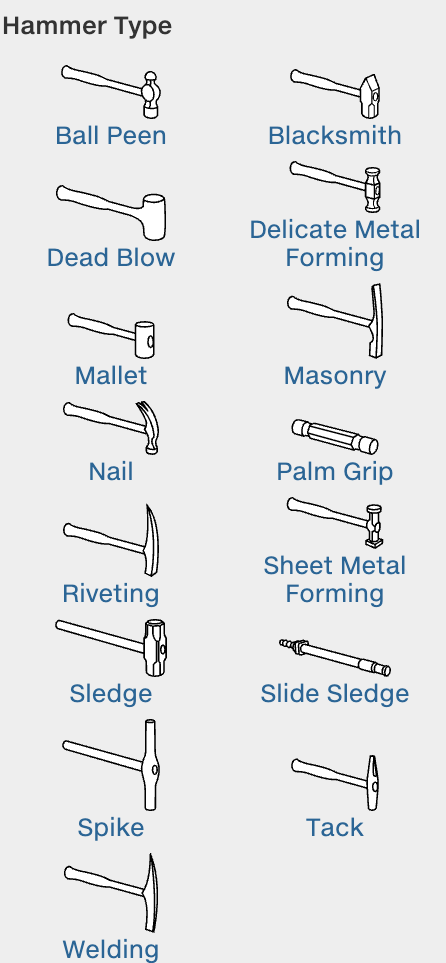
- Pictogram systems for mechanical attributes that are hard to photograph but critical for selection.
We also articulated a working principle we called “Facts vs Stories.”
- Facts are what you can see in an image: thread type, head shape, material finish, dimensional relationships.
- Stories require context, motion, or narrative: “this bolt won’t loosen under vibration,” “this grip is comfortable for extended use.”
Images in navigation should prioritize facts. Stories need motion, contextual photography, or explicit narrative support. The distinction shaped which rendering techniques we used where.
What Shipped
The team was one of the most capable I’ve ever been a part of. Patrice Payne and Sheena Tilley led us—brilliant, inimitable. Barkha Patel and I were the design resources for Navigation by Images; she’s a lead there now. Co-lead Mark Pachuki and colleagues Varun Gadh, Mira Staykova, Julia Pfatteicher, Samuel Kim, Justin Dunlap, Hanna Gratch, Audrey Thomas, Catherine Cloutier, and Emiko Meyers drove some of the most principled, restrained design I’ve seen in practice. Lisa Pomeranz was my peer mentor; her guidance made a real difference.
During my time on the team, we shipped:
Search improvements (led by Varun Gadh)—faster filtering, improved relevance.
Scale comparison system—products shown against human silhouettes (hand, finger, arm, full figure) so size feels intuitive. A motor on a fingertip makes “12mm diameter” land in a way specs alone don’t. Much of this was Justin and Samuel’s work, as I understand it.
Experiments with serendipitous browsing—a Patrice and Sheena brainchild, if I’m not mistaken. Ways to help people discover items they might not know they were looking for.
Additional Navigation experiments—most of what a user does on the McM site is navigate; we ran a bunch of other experiments in that space.
Pictogram guidelines—usage standards, size specs, semantic consistency across product families. Pictograms communicate mechanical attributes (bearing type, gear configuration, fitting detail) that photos can’t capture clearly at navigation scale.
Material rendering guidelines—when to use realistic materials vs abstract representations, how to balance the grayscale aesthetic with the need to differentiate materials visually. Developed alongside Chester Ong and Jeremi Li.
Navigation pattern refinements—incremental improvements to tiles, tables, and detail pages, informed by ongoing research.
WIP: Design principles guidebook—codifying McMaster’s design philosophy for internal teams.

What McMaster Teaches
Constraints as assets. McMaster’s grayscale, minimal, text-heavy aesthetic isn’t a limitation—it’s a choice. Removing color from product images sends attention to form, dimension, and specification. Performance constraints (no large JS bundles, fixed-size images, aggressive caching) force architectural clarity. You can’t hide slow decisions behind faster hardware.
Iconoclasm as strategy. In a landscape of Shopify templates and best-practice homogeneity, McMaster’s site looks like nothing else. That’s not stubbornness. Engineers don’t want delightful micro-interactions. They want the exact right M6 x 1.0 stainless steel socket head cap screw, 25mm length, delivered tomorrow, found in under 30 seconds. Designing for that means ignoring a lot of industry trends.
Serendipity within systems. The catalog isn’t just a database with a search box. It’s structured to support browsing—discovering parts you didn’t know existed, learning about adjacent solutions, understanding the design space of a problem. Images make the vast catalog scannable, helping eyes find patterns and anomalies quickly. Structure and serendipity aren’t opposed; the right structure enables browsing that no search query could replicate.
A publisher, not just a retailer. McMaster thinks of itself as a publisher. The catalog is a designed artifact. Every product description is technical writing. Every image is visual communication. Every page layout is information architecture. The company invests in this because clarity and accuracy reduce returns, support calls, and customer frustration. But it also produces something people actually enjoy using—engineers keep the physical catalog on their desks not just for reference, but because they respect it as a piece of work.
What I Learned
Working within strict constraints clarifies what matters. McMaster’s culture is data-driven to a degree I hadn’t experienced before. Every pixel has to justify itself. You can’t handwave about “better UX”—you need measurable improvement. The precision that environment demanded changed how I think about design arguments.
Image systems are cognitive infrastructure. We tend to think of images as content—things to place in layouts. At catalog scale, images are navigation tools. They’re how people orient themselves in vast information spaces, compare options, verify decisions. Designing image systems means thinking about semantics (what does this size mean?), performance (how do we deliver clarity without destroying page load?), and cognition (what visual information does a person need at this decision point?).
Principled companies are rare. McMaster is uncompromising about certain things: no tracking, no dark patterns, no optimizing for engagement over utility, no sacrificing speed for aesthetic trends. They’ve stuck with technology that works even when it’s not fashionable, and aesthetic choices that serve their users even when they look plain by consumer web standards. That kind of organizational conviction requires economic stability and a willingness to resist short-term optimization pressures.
Experimentalism is the work. What surprised me most about McMaster was how much room there was to try things. We weren’t just maintaining a catalog — we were running real experiments in how to show and tell people about industrial supplies. Different rendering approaches, different levels of abstraction, different ways of communicating scale or material or mechanical function. Not all of it shipped. That’s the point. Getting to do that kind of work, with people that talented, on a product with that much principled restraint built into it — I don’t take that for granted.
Optimization cultures have a shadow side. In any environment where performance is measured intensely, people start to develop superstitions — confusing correlation with causation about what makes their work succeed. They repeat the rituals that got rewarded and stop trusting their own instincts. The most interesting people I worked with at McMaster were the ones who hadn’t lost that — who still had a distinct voice and point of view underneath the rigor. I think that matters more than most companies realize.
Why This Work Matters
McMaster-Carr demonstrates that scale and speed don’t require sacrificing thoughtfulness.
At 600,000 products and sub-200ms page loads, every design decision compounds. Image file sizes, rendering choices, information hierarchy, the distance between intent and action—all of it matters, and at this scale the effects multiply.
The work on that team—image systems, navigation patterns, design principles—was about making vast complexity navigable without pretending it’s simple. That’s a different problem than most consumer products deal with, and one I keep coming back to.